
May 28, 2013 | Data Visualization, Engagement
Data Visualization unearthing stories’ powerful personas
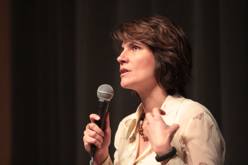
The audience drew to a somber silence as dots dropped into place during Kim Rees’ presentation titled U.S. Gun Deaths. In one of the International Symposium on Online Journalism’s most innovative panels, data visualization proved to blur the lines between copy and art.
Digging down into the data was a similar theme throughout each of the speakers’ presentations, which, in addition to Periscopic’s Rees, included ProPublica’s Scott Klein, The New York Times’ Hannah Fairfield and University of Miami lecturer, Alberto Cairo. Each of these publishers, while using different tools, explores new journalistic terrain that provides a deeper level of engagement and understanding amongst readers.
“There are a lot of sides to using visualization,” Rees said. “I personally believe the emotional side — I wouldn’t go so far as to say it’s mandatory, but it’s pretty darn close.”
Rees, who dedicated her presentation to Antonio Santiago, a deceased 13-month-old child who was shot in March, certainly provoked an emotional response from the crowd, as Twitter began to flood in mentions of her using the ISOJ hashtag.
Rees stated that regardless of a person’s political affiliation, data visualization provides a chance to reach readers in a new, dynamic format.
Similarly, The New York Times’ Snowfall broke new ground in 2012, as a daring integration of data visualization within a story. Jill Abramson, the executive editor of The New York Times, ISOJ’s keynote speaker, described Snowfall as “literally a new way of reading.”
Each of the speakers felt that combing and reporting provided the heart of their stories and that visualizations offered new life to an industry that has struggled to reach digital consumers.
“There’s really no better time, I think, to be in journalism,” Fairfield said. “The world really is our playground.”
Kim Rees, “Data Visualization” panel from Knight Center on Vimeo.